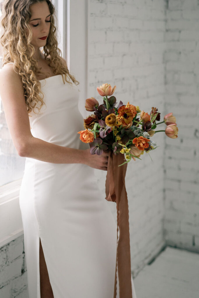
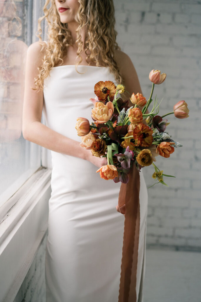
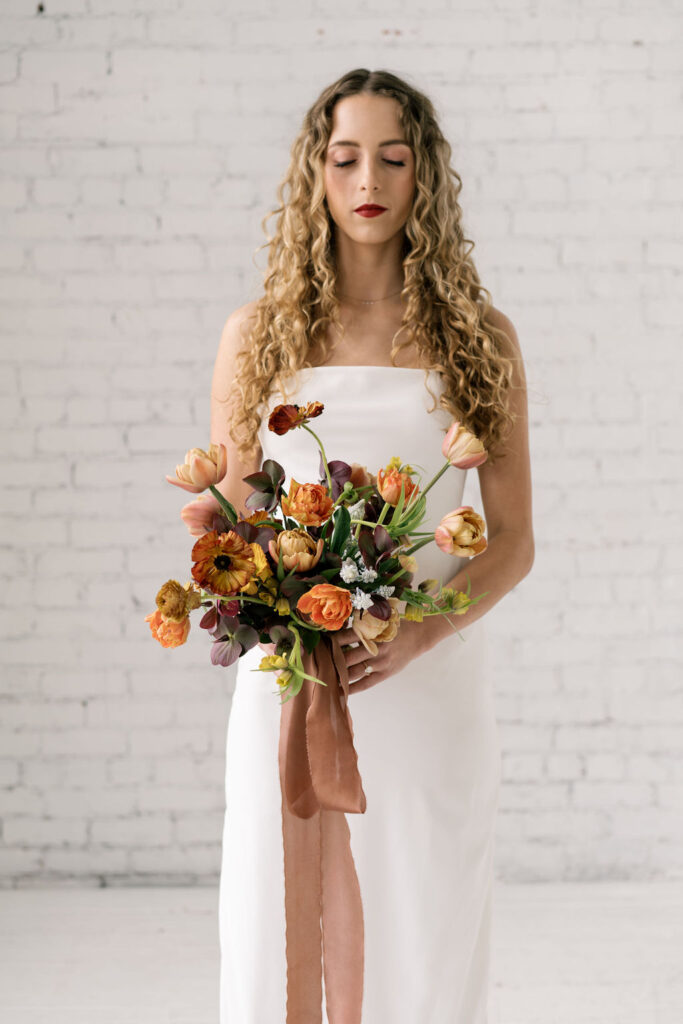
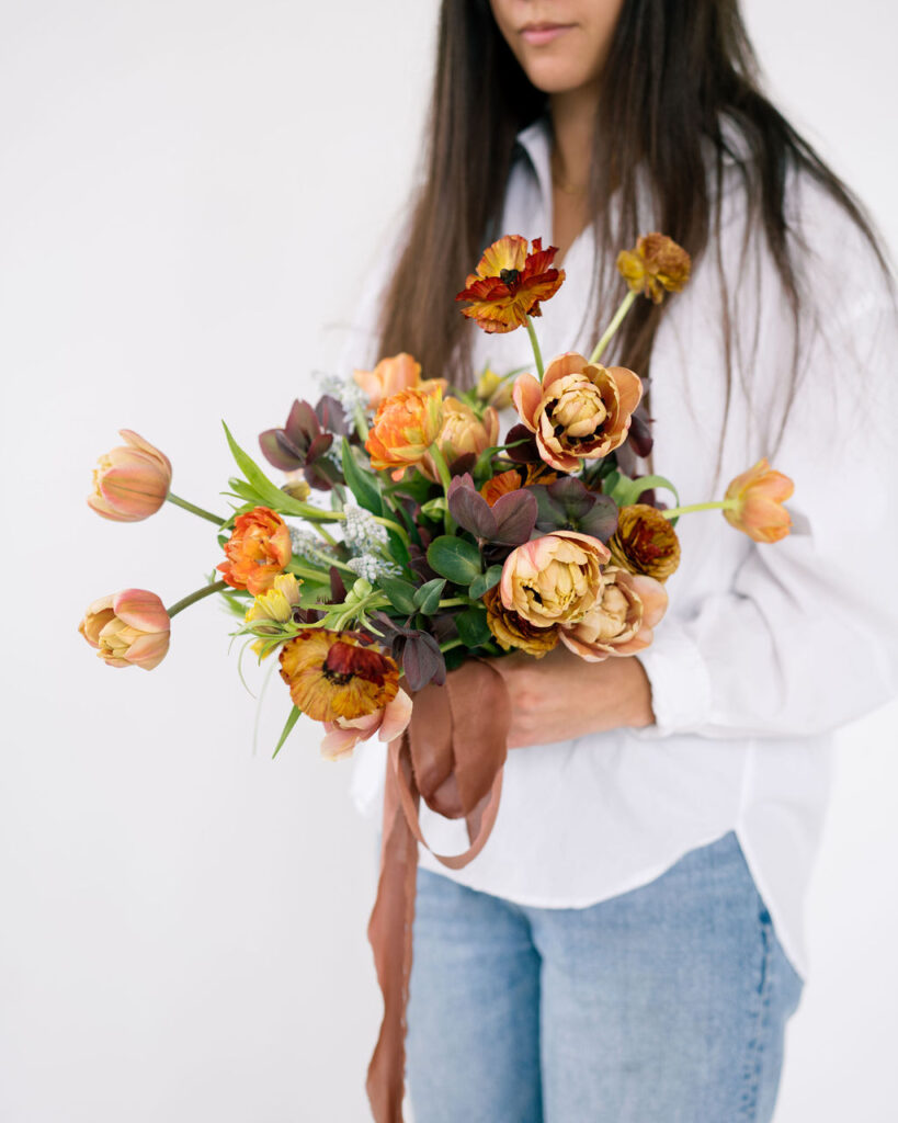
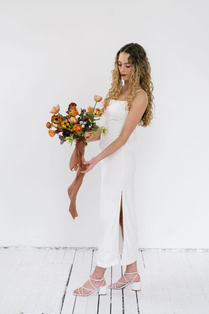
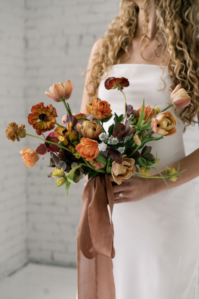
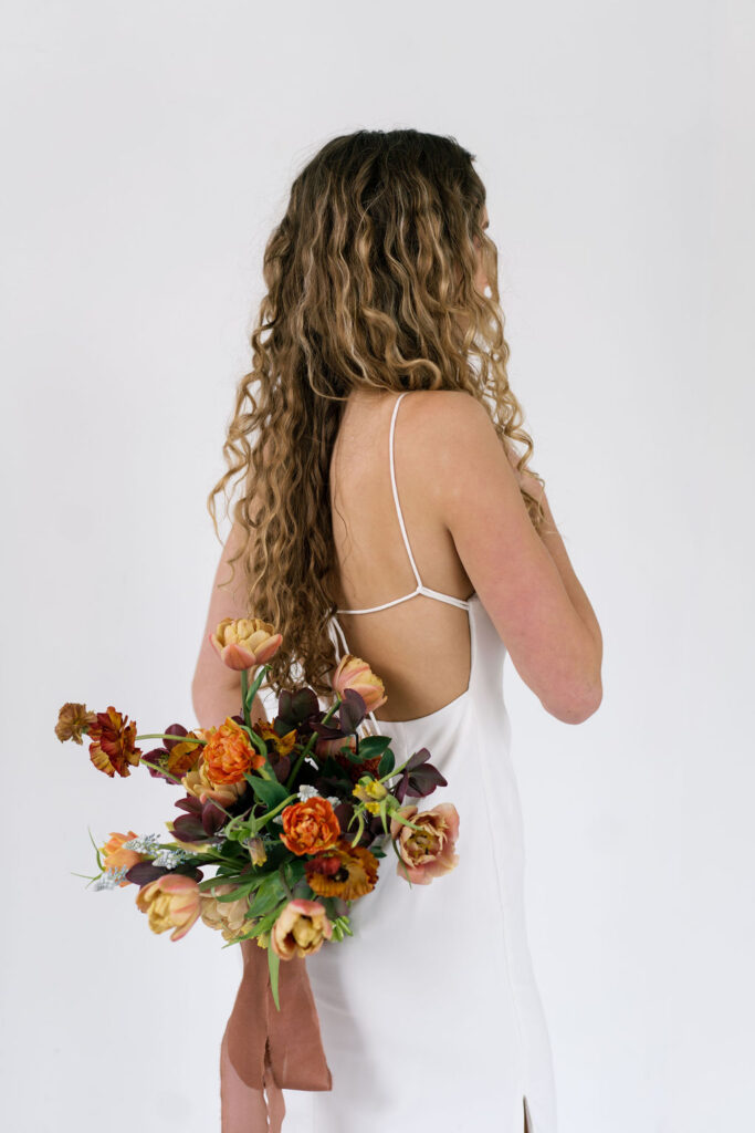
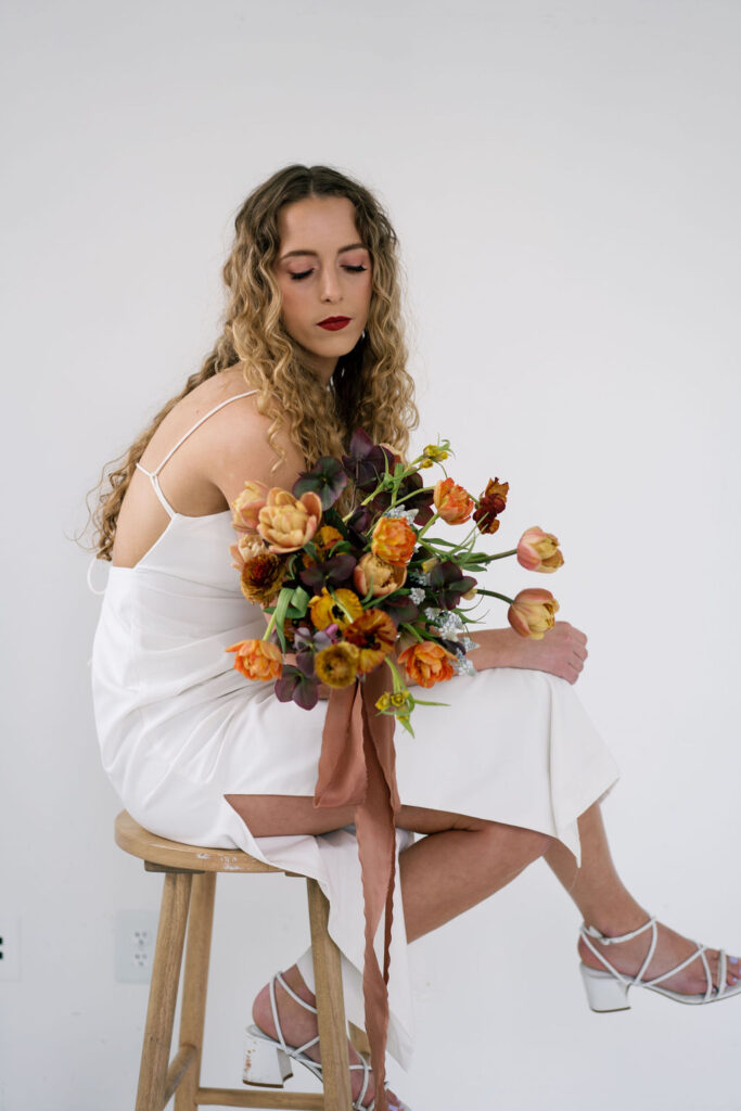
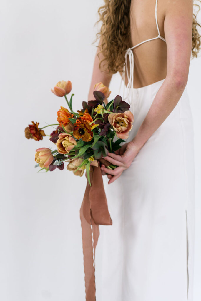
A Moody Spring Color Palette
As you’ve seen in previous projects, I love experimenting with the forgotten sides of seasons. Such as the uncommon vibrancy of winter or the quietness of summer. I first stepped off the path of typical spring aesthetics in a past session, to explore the earthy and strong side of spring. This time, I dove head first into even more unknown territory. A darker side of spring than I’ve ever been drawn towards.
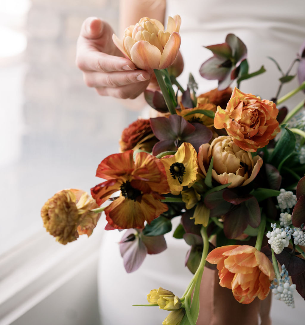
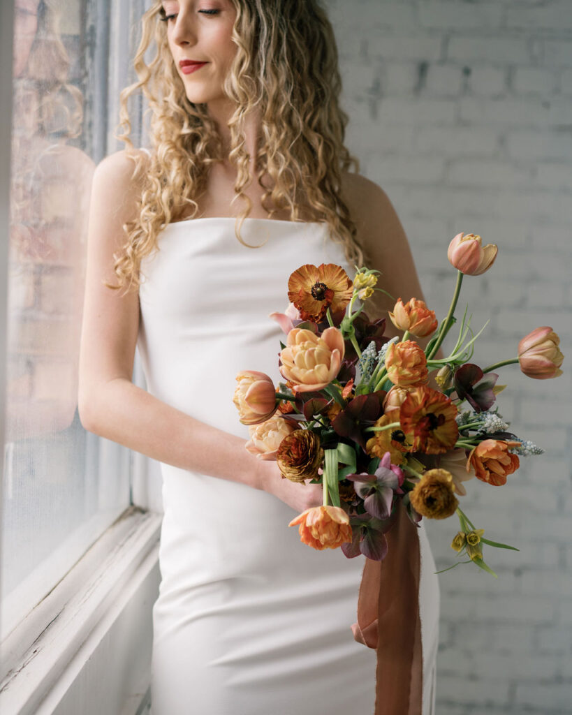
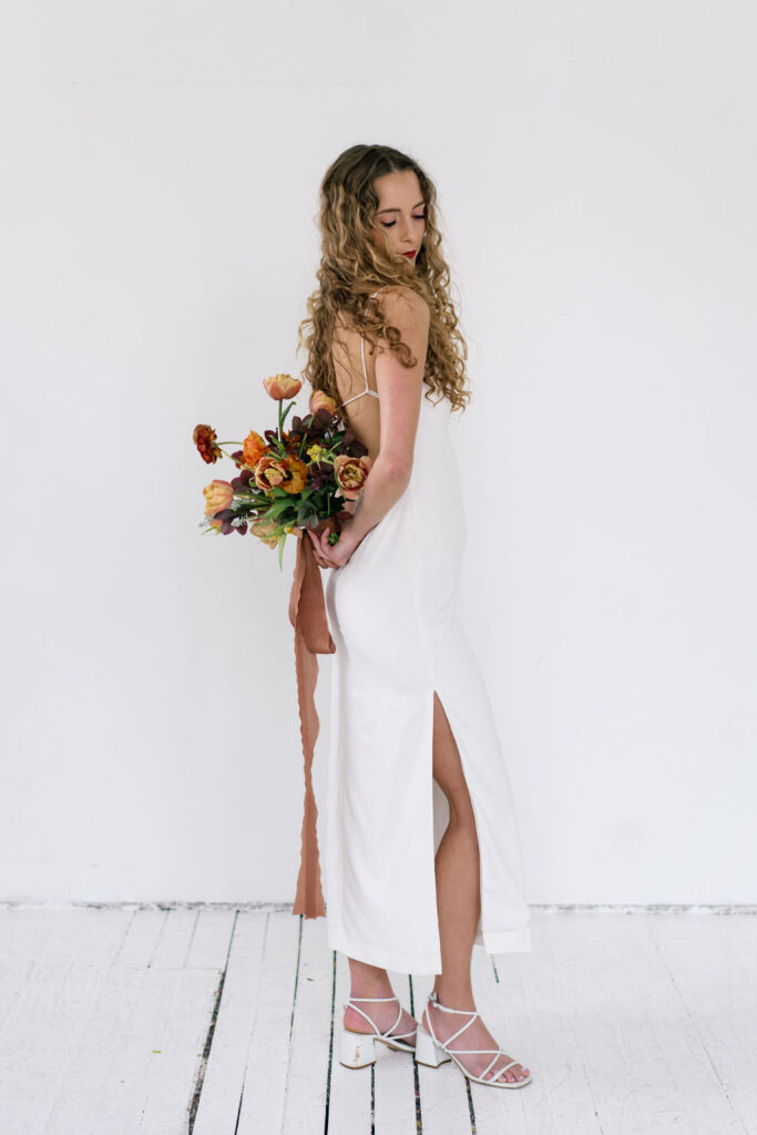
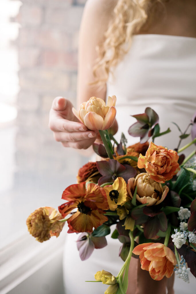
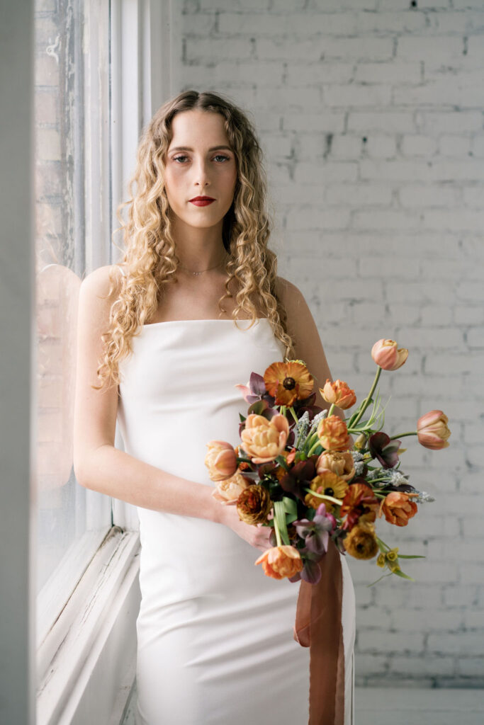
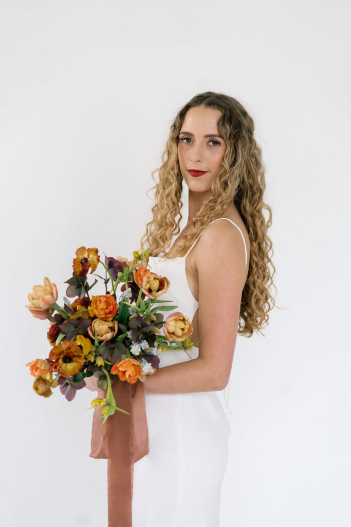
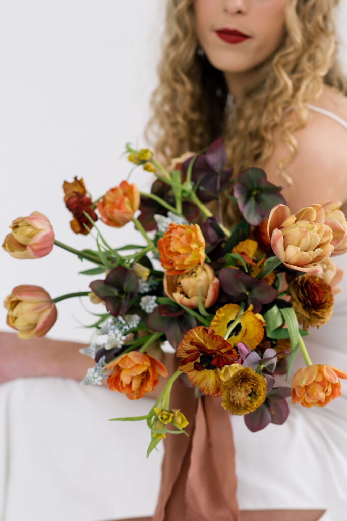
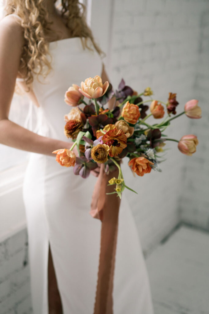
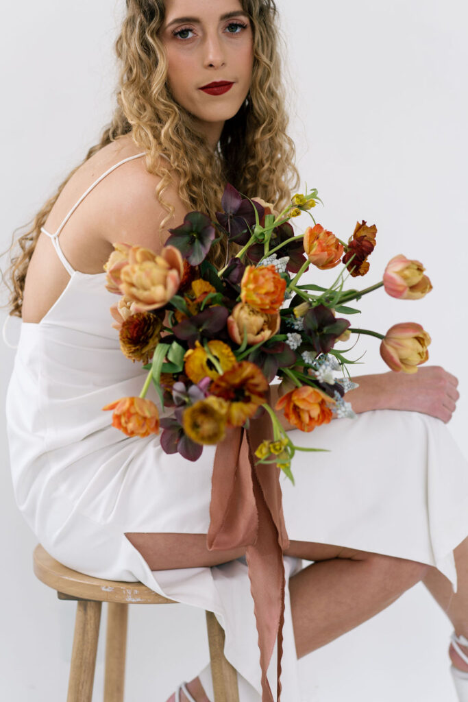
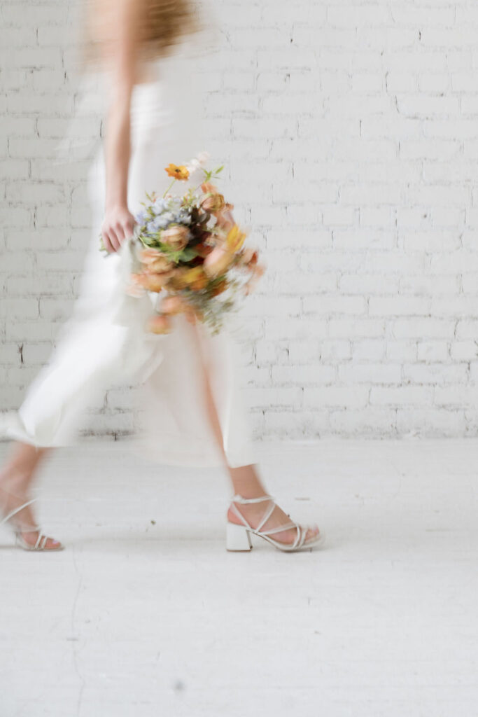
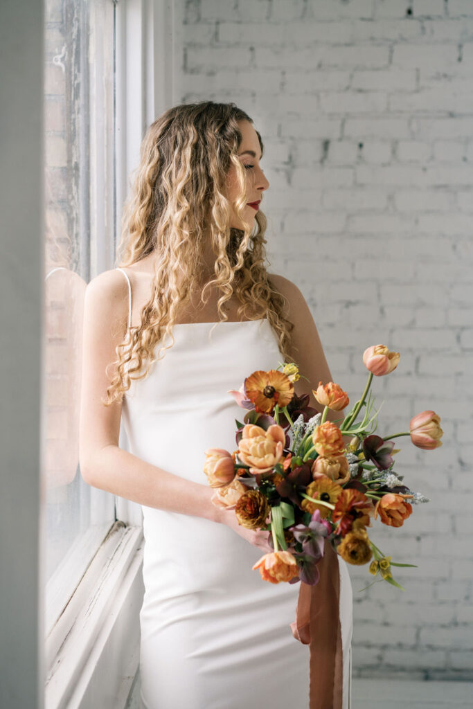
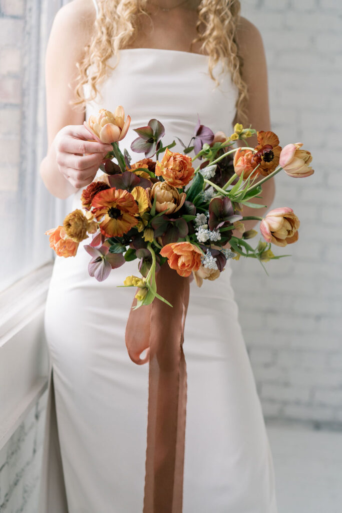
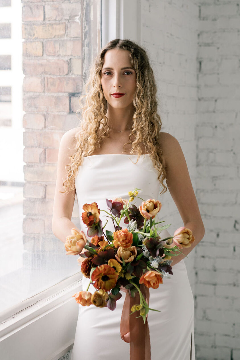
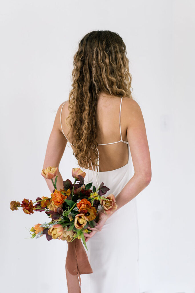
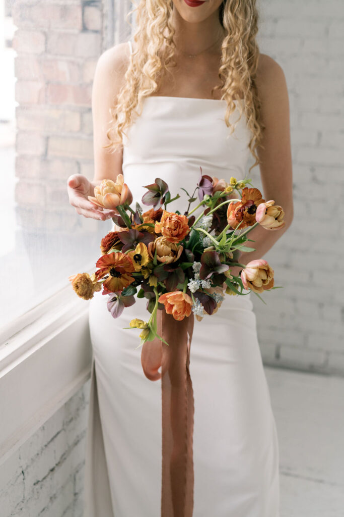
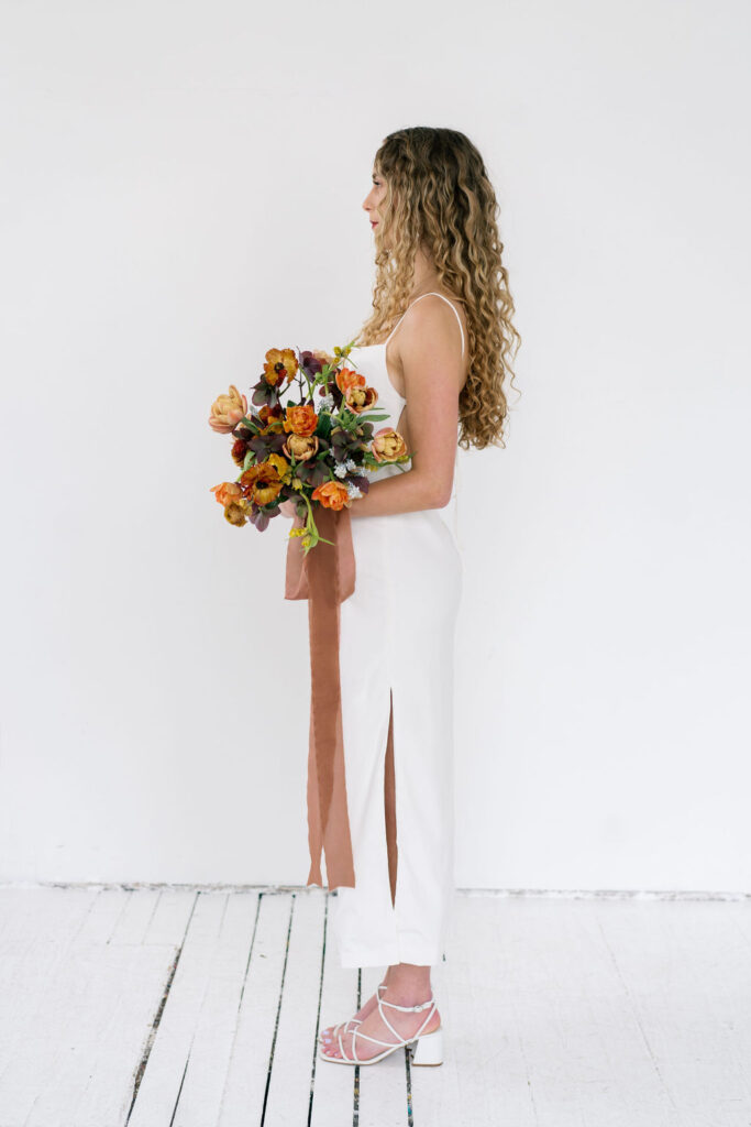
Deep plums, copper reds, burnt orange, and a burst of blue created a new depth and perspective of spring I hadn’t yet discovered. If a familiar spring palette is delicate, ethereal, a breath of fresh air, then this one is a full-bodied gust of new energy. Vivid, rich, and resounding.
This moody color palette was still built around tulips, the quintessential spring bloom. A reminder that less-celebrated (but just as beautiful) sides exist in any season, we just need to give them an audience.
Other Vendors From This Shoot
Photographer – Jenessa Lynne Photo
Studio – Studio Noire Noir
Model – Ashlyn Livingston
HMUA – Bridal By Caitlin
Ribbon – Native Ribbon Co.
